The SIGGRAPH 2003 logo was developed over the course of several months preceding SIGGRAPH 2002. It was developed by a team of graphic designers and marketing specialists in collaboration with the SIGGRAPH 2003 conference committee.
An early meeting established the core message the logo was to convey: the annual SIGGRAPH conference as a bridge that unites the computer graphics and interactive techniques communities, a place where knowledge is exchanged through interaction, creation, and collaboration among people, concepts, and technologies.
Initially, the designers sketched and presented 20 logo concepts ranging from the literal to the very abstract. Their imagery focused on everything from San Diego's seaside scenery to the deep geometry and mystery of crop circles. The committee chose an early version of what is now the SIGGRAPH 2003 logo as one of six concepts for further refinement.
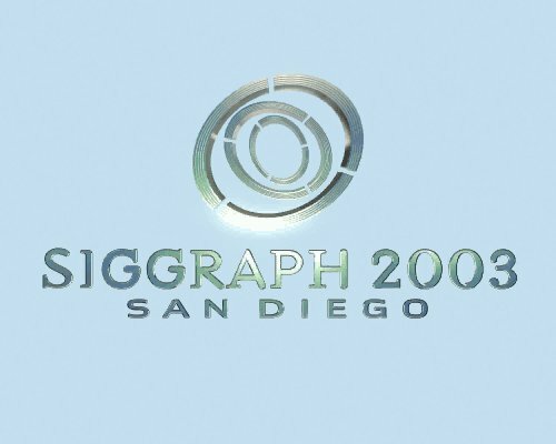
After more review and discussion, the committee decided that one of those six concepts showed great promise in accurately conveying the message of SIGGRAPH 2003. Its three concentric rings with intermittent connectors and cuts symbolized a core of knowledge, those who disseminate that knowledge, and those who receive it. The abstract nature of the three-ring design conveyed a geometry that suggested the complex mathematics of computer graphics and interactive techniques applications.
The three-ring concept also suggested other metaphors: a portal, an eye to the future, and even an allusion to the architecture of the San Diego Convention Center. The correct messages were being conveyed, but at this point the logo was decidedly flat and lacked the dynamism and excitement of the annual SIGGRAPH conference.
Further exploration and refinement of the three-ring design yielded many variations, and the designers found that by tilting the rings, adding dimension, and rendering them in space, they could generate a kinetic quality that spoke more directly to the computer graphics and interactive techniques community. Typography was added to complement the hard and soft edges in the final logo, and color choices tied the logo to the convention center and the surrounding scenery in San Diego.
Animation of the SIGGRAPH 2003 logo was contributed by ART VPS Ltd. A Quicktime version of the logo animation was then delivered to Q LTD where it was converted to the Flash file format.
artvps.com
www.qltd.com
www.siggraph.org/s2003/